Top retailers are constantly pushing boundaries and innovating on their store design to build a trustworthy brand that drives high sales growth.
Your website design plays a huge role when it comes to customer trust. If your website looks unprofessional, out of date, or has blatant spelling errors it can prevent customers from buying on your store. While you don’t need to spend thousands of dollars to create a trustworthy store, you do need to invest in time. There are steps you can take to ensure your website is up to today’s standards which you’ll find in the tips sections. However, when it comes to website design you shouldn’t stop there. You also need to think about optimizing your online store for conversions.
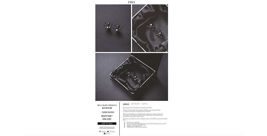
Website Design Ideas Example: Phix Clothing has a unique website layout. While a top navigation is often most intuitive for most consumers, they’ve chosen to add their navigation on the left hand side. Another remarkable difference between Phix and the average ecommerce brand can be found on the product page. Their Call to Action (CTA) is found on the bottom of the page. Not above the fold. For a customer to find the ‘add to bag’ button, they need to browse ultra large product images that show great detail. After they’ve scrolled through the images, they’ll find a large black add to bag button with a striking contrast against a white background. While we don’t know how well this page converts, it may be a great split test experiment to run.
Website Design Ideas and Tips:
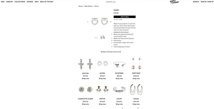
Dannijo has a non traditional product page. Above the fold, the product page looks standard. It includes pictures, copy and an ‘Add to Bag’ button. However, below the fold, you’ll find a product collection. Typically, retailers put 3 or 4 recommended products. However, Dannijo has 35 different products listings on the product page. That allows customers to stay on the same page after adding an item to their cart. While we can’t confirm if it has helped boost average order value, it’s definitely an experiment worth trying.
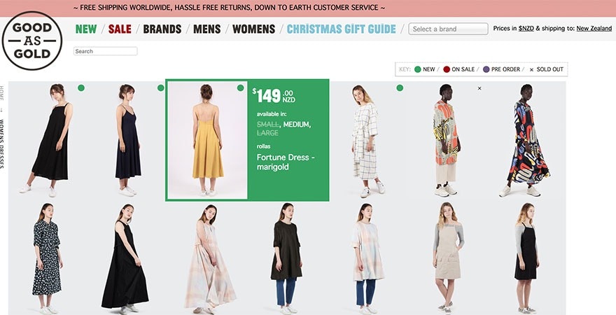
Good As Gold has a unique product collection page. While customers browse photos, they can hover over an image to find product details. You’ll see details like price, available sizes, whether or not it’s sold out and the product name. This helps ensure that customers are ready to purchase by the time they get to the product page. They’ll know if their size is available and if the price matches their expectations.
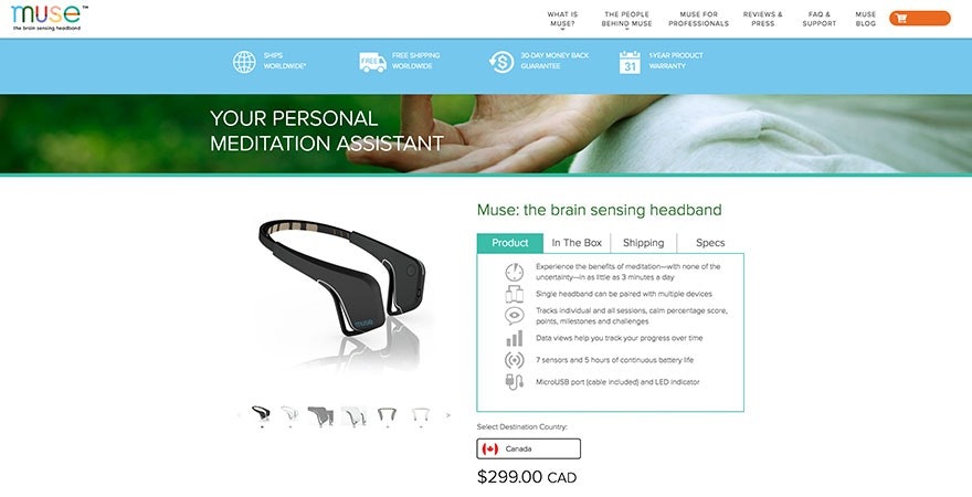
Muse optimizes their store by having a ‘Add to Cart’ button on their homepage. While most store owners only have add to cart buttons on the product page, you can add it on other pages that receive a high number of traffic. Muse putting the CTA on the homepage is likely due to a high number of people landing on that page. Similarly, Estee Lauder added ‘Add to Cart’ buttons on their About Us page. Jeffree Star Cosmetics allows customers to add an item to their cart from the collections page. After an item has been added to cart, a pop-up appears asking the customer whether they want to continue shopping or head to their cart to begin the checkout process. When working on your website design, remember to optimize for ‘add to carts’ on the pages with the most traffic. Otherwise, you could be losing money.
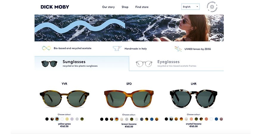
Dick Moby simplifies online shopping with swatches. While color swatches are typically found on product pages, this brand also adds them to product listings pages. So while a customer is scrolling through the images in a product collection, they can hover over different colors before landing on the product page. While it might reduce the number of eyes on a product page, it does help qualify the customer earlier on. When a customer hovers over colors, they change. However, once a customer presses down on a color they’re directed to their product page where they’ll be able to make a purchase.
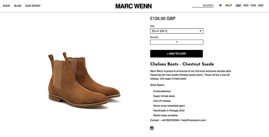
Marc Wenn has a unique product page design. When a customer scrolls, the product images change, however the product details and add to cart button stay static. This may help with conversions as the CTA stays above the fold despite scrolling.
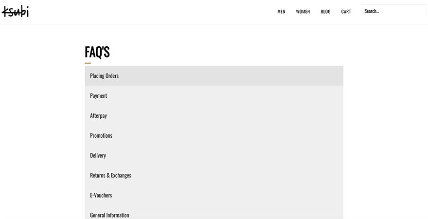
Ksubi has a unique look for their FAQs page. You can list your questions and answers in plain text on an FAQ page. However, the page will likely be long making it harder for a customer to find the answer to their question. Their FAQ page is divided into 9 sections including placing orders, returns & exchanges, international orders and general. Within each section, customers will find questions and answers to the most common questions the brand receives. A customer needs to click on the section for a dropdown to appear. This helps create a cleaner look.
The Home Depot has a Track Your Order feature on their store. This feature allows customers to track their purchases online with ease. It also helps minimize the number of customer support inquiries. Including a feature like this on your store can allow your customer to get an immediate response on their tracking inquiry improving customer satisfaction. See the tools section to find a Shopify app that can do this on your store.
Make use of modern design principles. You’ll want to keep your design simple. And make sure your layout is intuitive. Does your website look like an ecommerce site? While it can be great to push boundaries to stand out, it can also be harder for your customer to navigate. The way your product page flows should be what customers are used to. The add to cart button should contrast with the background, even if the customer doesn’t speak the language your site is written in.
Make sure your images look professional. Invest in quality stock images. On average, lifestyle images work best as banner photos. Avoid stock photos that look cheap. There are many great free stock photos on Burst, Shopify’s collection of quality images made specifically for store owners. However, not all free stock images are made equal. Some images can really bring down the reputation of your brand. Avoid cheesy images. Or images that have dated graphics.
Keep your website up to today’s standards. You’ll need to resize large images to ensure you maintain a fast page speed. If you’re on Shopify, you won’t have to worry about your site crashing. If you’re not shopping, you might want to make the switch before Black Friday to ensure that your website doesn’t crash on the most important day of the year.
Make sure your contact information is visible on your store. Many dropshippers avoid having contact information making it hard for customers to contact you. If a customer realizes they can’t contact you before a purchase it can make your brand seem less trustworthy. You need to be accessible to your customers.
Website Design Tools:
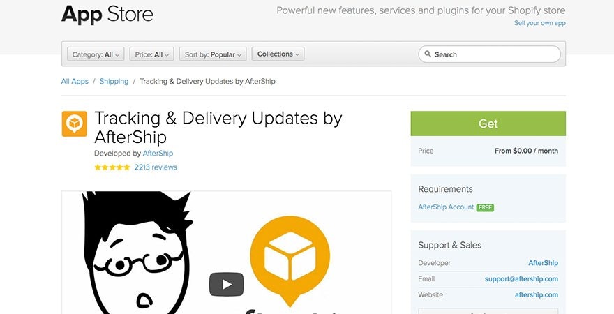
AfterShip is a great order tracking app used by thousands of Shopify stores. Customers can track their packages on their own without having to contact support about it. Updates are made regularly so customers are always in the know.
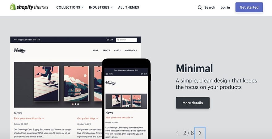
Shopify Themes are a great way to liven up your website’s design. If you’re starting out, you could still make a free theme look great with some of the other tools on this list. Ideally, you want to pick a theme with an intuitive look with the navigation bar on top instead of the the side. My go to free theme is Minimal but any of those Shopify themes work fine. You can easily sort through themes based on the niche your store is to ensure your website design matches your audience. You’ll find themes for clothing and fashion, jewellery, toys and games and more. You can also browse based on collections such as minimalist, fun and lively, great for large inventories and more. Themes are also categorized by price, number of products, layout style, product page features, marketing tools and more.
Hey Carson is a full service ecommerce company. Their team of ecommerce experts can help store owners of all levels complete small tasks. With a 9.92 out of 10 rating customers tend to be happy with the level of service the team brings. They’ve worked with over 6000 store owners to deliver tasks such as adding social media buttons, adding a second product image with hover, installing a custom font and more. Single tasks start at $79 USD but you can also pay for a monthly unlimited tasks for a $249 a month fee.
Burst is Shopify’s free stock photo site. Finding the right images for your website can be a bit of a challenge especially if you’re on a budget. Many of the products used in Burst’s stock photos come from Oberlo’s top suppliers. You’ll find pictures for various popular niches such as phone cases, fitness, fashion, jewelry, pet, and more.
Creative Market offers a selection of fonts, graphics, templates and more. Whether it’s time to update your logo or improve the branding on your social media, you’ll find the accessories you need to upgrade the look of your store and marketing materials.
Shopify Experts is a database of experts who can help build up your online store. Their database of experts specialize in one of five areas: store setup, store design, development, marketing, and photography. When hiring a Shopify expert, you can choose someone based on your needs and budget. You can also browse the Shopify Experts Directory if you’d prefer to choose one yourself. There are experts for each major timezone to ensure you can find someone within your hours of business.
Website Design Resources:
30 Amazing Examples of Ecommerce Website Design lists 30 examples of stores who have strong design skills. The stores on this list are what you should try to make your store look more like. Many are Shopify stores meaning you’ll likely find the same theme within Shopify’s database. Pay attention to what the stores all share in common. Use those commonalities when designing your own store.
14 Essential Tips for Improving Your Web Design delves into tips to ensure your website redesign is a success. It covers what type of content to remove from your website, features to include and implement, how to improve your navigation while sharing which tactics are outdated.
10 Best Practices to Improve Your Ecommerce Website covers how to increase usability with great product photography, product selection, and intuitive navigation. It also details how to increase visibility with search engine optimization, Pay Per Click (PPC) advertising, etc. The article also mentions how to increase your conversions with A/B testing and effective copywriting.
